

South Shore Schools still haven't recovered from Covid. A five-year analysis shows who’s delivering — and who isn’t.
Three years after schools reopened, only one of 21 South Shore districts had returned to pre-pandemic MCAS levels based on State data. Nine are still declining. And the gap between affluent and working-class communities is 4.1 percentage points wider than it was before the pandemic.
Editor’s Note: This is an experiment in original analysis inspired by the debate around the “Mississippi Miracle.” I’m using AI tools to break down publicly available education data to see what trends emerge beyond “higher per pupil spending leads to better MCAS scores.” Think advanced baseball statistics like Wins Above Replacement — who is exceeding their demographic and spending expectations. I used Claude to help build the regression models and the visualizations; the data is from public DESE files, the methodology is in a downloadable spreadsheet, and every number is reproducible.
The recovery that hasn’t happened — here or anywhere
In 2019, the average grade 3-8 MCAS Avg Math+English proficiency across all 396 K-12 districts in Massachusetts was 46.7%. On the South Shore, it was 57.8% — roughly eleven points above the state. By Spring 2021, the first MCAS administered after the pandemic shutdown, the state average had fallen to 37.1%. The South Shore had fallen to 47.6%. Everybody dropped. No region, no income tier, no district type was spared.
So, how much has come back? The answer is: nothing.
The 2024 state average is 36.6% — half a point below the 2021 trough. Massachusetts K-12 students are not recovering from COVID learning loss. They are still losing ground. Only 53 of 396 K-12 districts statewide have returned to their pre-pandemic baselines. Nearly half — 187 of 396 — posted 2024 scores that were lower than 2021.
The South Shore is doing slightly better than that, but only slightly. The 2024 regional average is 48.5%, about a point above the 2021 floor. That puts the South Shore at the 65th percentile for recovery statewide — better than most, but still 9.3 points below where it was in 2019. Twenty of twenty-one districts remain below their pre-pandemic baselines. Only Cohasset has fully recovered to its 2019 level. Nine districts are still declining.
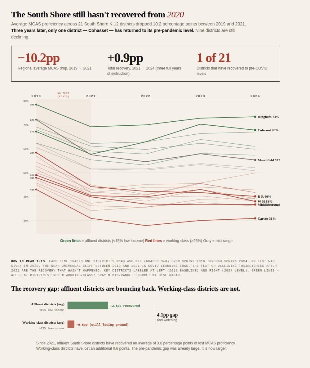
Each line tracks one district’s MCAS Avg M+E (grades 3-8) from 2019 through 2024. The cliff between 2019 and 2021 is universal. The flat or declining trajectories since are not. Green = affluent districts; red = working-class; gray = mid-range.
The recovery gap is real, and it’s an equity story — both on the South Shore and statewide. Since 2021, the statewide pattern by income tier looks like this: affluent districts (less than 15% low-income enrollment) have recovered an average of 1.1 percentage points. Middle-income, working-class, and high-poverty districts are all still declining. Only the wealthiest tier has clawed anything back. Every other tier is sliding.
On the South Shore, the same pattern holds but is more pronounced. The six most affluent districts in the sample — Hingham, Cohasset, Norwell, Duxbury, Scituate, Hanover — have recovered an average of 3.6 percentage points since 2021. The ten working-class districts (more than 25% low-income) have lost an additional 0.6 points. The gap between those two groups was already large before the pandemic. It is now 4.1 percentage points larger, and widening.
This is not a story about school reopening timelines — those debates played out years ago. This is a story about which communities have the resources, both inside and outside the school system, to rebuild lost learning, and which ones don’t. Private tutoring, stable home environments, summer enrichment, parent availability — these factors show up in the data as affluence, not as school quality.
A few numbers worth sitting with:
Bridgewater-Raynham dropped from 58.4% to 40.1%, a net loss of 18.3 points — and has declined in every single year since 2019, including after the 2021 trough. It is still falling.
Marshfield dropped from 72.2% to 55.3%, a net loss of 16.9 points — the largest absolute decline among traditionally strong districts.
Carver dropped from 43.0% to 30.9%. It started low, lost 12 points, and hasn’t recovered.
Hingham dropped from 78.5% to 73.4%, a net loss of 5.1 points. It has recovered 45% of its initial drop — the best recovery rate among non-Cohasset districts, and well above the state affluent-district average.
Cohasset is the only full recovery story in the region: 67.2% in 2019, 57.7% in 2021, 67.8% in 2024. Nobody else — on the South Shore or in most of the state — has come all the way back.
So within a region where almost everyone is underwater, is anyone actually doing better than expected?
That’s the question the rest of this piece tries to answer. The raw MCAS numbers above tell you who’s up and who’s down — but they can’t tell you whether a district is underperforming or just serving a harder population. Hingham at 73% and Carver at 31% are measuring two different things — the district, and the zip code. To ask whether a district is getting its money’s worth, you have to first ask: what should we expect from a district that serves the students it serves and spends what it spends?
I built a model to answer that. For each of the past five years of data (no MCAS was taken in 2020), I ran a regression that predicts MCAS Avg M+E (the average of ELA and Math meets-or-exceeds rates for grades 3–8) from four variables: the share of students who are low-income, the share who have disabilities, the share who are English learners, and the in-district per-pupil spending. Then I compared each district’s actual score to the prediction. The difference — the residual — tells you who’s beating expectations and who’s falling short.
If the answer changes year to year, it’s noise. If the same districts land on the same side for five years in a row, it’s a pattern. And the pattern is clear: eleven of 21 South Shore K-12 districts have stayed on the same side of expectations every single year from 2019 through 2024. Five consistently above. Six consistently below.

Districts grouped by whether they outperformed (above) or underperformed (below) statistical expectations every year from 2019 through 2024. Name size reflects magnitude of average residual. “Mixed” districts crossed the zero line at least once.
Why the obvious comparison is wrong
The naive way to ask “are we getting our money’s worth?” is to plot per-pupil spending against MCAS scores and see if the dots line up. Spend more, get more.
The dots do not line up. Hingham spends about $20,500 per pupil and posts 73% MCAS proficiency. Cohasset spends $22,500 — two thousand dollars more per child — and posts 68%. Plymouth spends $22,100 and posts 42%. Carver spends $19,200 and posts 31%. Bridgewater-Raynham, the cheapest-per-pupil district in our sample at $16,100, posts 40% — better than Plymouth, which spends almost $6,000 more per child.
If money were the answer, Cohasset would be Hingham. It isn’t, and that’s the whole problem.
What’s actually happening is that MCAS scores are dominated by something the headlines rarely lead with: the share of low-income students in the district. The correlation between Low Income % and MCAS Avg M+E across these 21 districts is −0.85. That is not a small number. That is a number that says: if you tell me what fraction of your students qualify as low-income, I can predict your grade 3-8 MCAS scores within a few points without knowing anything else about your district.
Cohasset (7% low-income) and Carver (27% low-income) and Holbrook (45% low-income) are not playing the same game. Comparing their MCAS scores side by side without that context isn’t analysis. It’s misdirection. To ask whether a district is getting its money’s worth, you have to first ask: what should we expect from a district that serves the students it serves and spends what it spends? Then you can measure whether the actual outcomes are above or below that expectation.
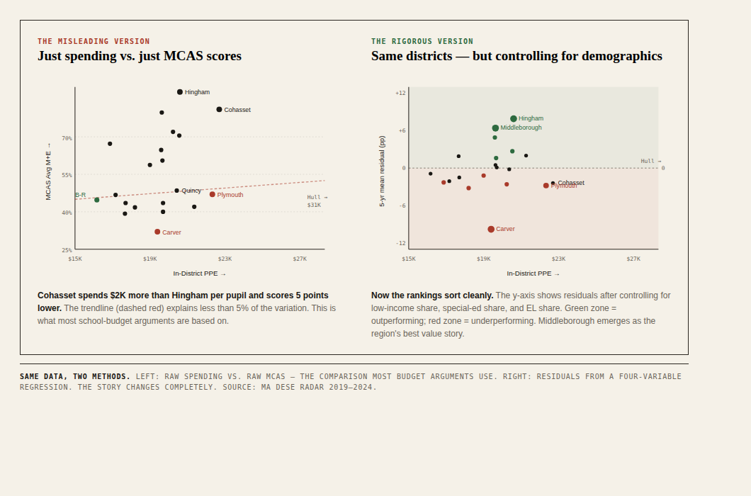
Same data, two methods. Left: raw spending vs. raw MCAS — the comparison most budget arguments rely on. Right: residuals from a four-variable regression that adjusts for who each district serves. The story changes completely.
The method, in plain language
For each of the past five years, I built a simple statistical model that predicts a district’s MCAS Avg M+E from four things: the share of students who are low-income, the share who have disabilities, the share who are English learners, and the in-district per-pupil spending. Then I subtracted the prediction from each district’s actual MCAS scores. That difference is the residual.
If a district scored higher than the model predicted, it’s outperforming the combination of its demographics and its budget — call it a positive residual. If lower, it’s underperforming. The number is in percentage points: a +5pp residual means the district is delivering five percentage points more MCAS proficiency than peers serving similar students at similar cost.
I ran the model five separate times — once for 2019, then 2021, 2022, 2023, and 2024. (No MCAS was administered in 2020 because of the Covid-19 pandemic.) Doing it five times is the whole point. One year of data is an anecdote; a district can have a bad cohort or a great cohort by chance. Five years of data, with the same district landing on the same side every time, is a pattern.
Methodology, abbreviated:
Source: Massachusetts DESE Resource Allocation and District Action Reports (RADAR), district-comparison file. Publicly downloadable.
Sample: 21 K-12 districts in the SSN coverage area. Excludes voc-tech regional schools (different cost basis) and Silver Lake (partial regionalization).
Method: Ordinary least squares regression, four predictors (Low-Income %, SWD %, EL %, In-District PPE), one outcome (MCAS Avg M+E grades 3-8).
Pairing: FY[N] spending paired with Spring [N] MCAS — same school year.
Model fit: R² ranged from 0.80 (2019) to 0.91 (2023). The PPE coefficient was positive in all five years.
Caveat: The model doesn’t measure curriculum, teacher experience, principal turnover, building quality, or out-of-district placement rates. It measures “are you above or below where the four variables we have predict you should be.”
Important note on peer group: Residuals shown in this article are against the 21-district regional peer group. When the same model is calibrated against all 394 Massachusetts K-12 districts, several rankings shift. See “A test of the method” below.